Here’s some more bad dataviz
2018-07-13
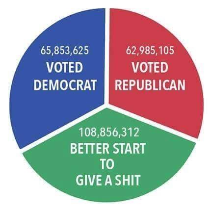
So, each of those numbers is approximately 1/3 of the total, or so the slices of the pie would suggest?
Oh, guess not…
So, each of those numbers is approximately 1/3 of the total, or so the slices of the pie would suggest?
Oh, guess not…